Tag Archives: Website

Training Tips: Making Your Website Work

Websites are awesome. And they are necessary for sharing information with your community members. We are an information profession; our whole purpose is to help patrons find information they need. A handy website is one important tool in making that happen.

Check out this week’s Advocacy Alchemy for some ideas and encouragement on getting started with your website.

So now we are ready to design that website – yay!

Any good website needs a few basic things to make sure your website works for your community members. Include these things to make your site usable and user-friendly.

  • Readable. The type needs to be big enough to be read easily – even by little old ladies like me who can’t see small type. Also add in a bunch of white space so it’s not too cluttered. You want the important stuff will be be immediately obvious.
  • Look pretty. You want a site that looks nice. Don’t add in lots of flashy things, blinky things, or other annoyances. Colors are nice, but you want to keep one or two; don’t over-decorate. Graphics and videos are nice – but remember: Everyone hates audio and video that self-starts. Don’t inflict that on your community.
  • Limit clicks. I can tell you from personal experience that once you start adding webpages, it’s surprisingly hard to stop. Just keep in mind the very basic usability idea that people should never have to click more than three times to get where they want to go. More than this, and people will get frustrated and move on to another information source.
  • Trendy. When you spend your days browsing websites and online resources, you get a feel for what other people are doing with web design. While you do not need to copy someone else’s site directly (copyright!), it’s okay to use popular design elements to help encourage your patrons to find what they need.
  • Fast! You know that in the online world, speed counts. If a patrons has to wait three seconds for a page to load on their phone – they are gone. You web host may be able to give you suggestions on speeding up your site’s loading time.
  • Good information. Think about what your community members will want to know. Hours are basic, your phone number is good, a web map is handy. Clearly, you want a catalog front and center. A staff page, or at least an email people can use to contact you.


Setting up a good website is going to be a little more work than just these things. But you have to get started somewhere!

CMLE members: we can help you to set up a basic site. Please get in touch with us today, and let’s get started sharing information with your students and other patrons!


CMLE Resources: Site Map

World map blank without bordersIt’s not the most flashy part of our website, but the Site Map is a handy tool for you.

Our job, as a multi-type system, is to provide information, resources, and assistance to our 300+ members. So our website is bursting with all kinds of things that might be helpful in different situations, to different kinds of libraries, archives, history centers, and more.

It gets confusing. Things seem jumbled.  There is a lot to consider, and a lot to look at.

No worries, however! We have your back on this. We have spent a lot of time thinking  through the organization of the site, to make it as useful to you as possible.

Our Main Menu items are here: (There are a lot of links under each menu item, so you have plenty of material to browse around here.)

  • Welcome! Start Here
    • All kinds of information is here, including our contact information, our bylaws, our Board information, and more.


  • Subscribe to Us!
    • On this page you can subscribe to our social media, Linking Our Libraries podcast, online book groups, and weekly newsletter


  • Check Out Some Amazon Shopping!
    • If you want to check out some fun Amazon products, and you click our links, a small portion of the money you are already spending at Amazon will come back to CMLE.

You can start here to find what you need; and if you get stuck just contact us. You can find all of these links in our menu, so feel free to take some time to browse around and maybe find some fun new items!

We have organized this site for you, to provide you with information and resources to make your work easier. If you have material to contribute – send it to us! If you need some information we do not have up there yet – let us know!

CMLE's web redesign week is Dec. 14th – 20th, stop in and say hello!

holiday-1
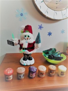
Snowmen and Sound of Music candles at CMLE HQ!

Here at CMLE Headquarters, we have eagerly been awaiting the chance to dive in and make some changes and improvements to our website. Mid-December would be the perfect time to do that! During the week of Dec. 14th – 20th, we will be here at HQ devoting our focus to website redesign. We are sharing this information with you in case you have some suggestions for the updated website! Is there anything you’d like to see more of, certain features that would make the site more accessible, or templates that you find especially useful? Let us know! Email us or feel free to stop in during our week of web redesign.

holiday-3Since we love the holiday season, if you do stop in, we will show you around our decorated space and share some yummy treats – maybe even some hot chocolate! You can feel free to chat with us about libraries, websites, or your holiday plans.

holiday-2Hope to see you then!

CMLE has a new look!

sunflower
Image credit: https://unsplash.com/(Khara Woods), licensed under CC0

Welcome to the newly-updated CMLE website! We decided a fresh new look would be a great way to start off a new academic year of publishing. Another new feature is our Continuing Education page. Make sure to check it out for great professional development opportunities!

Keep your eyes open for more changes that we will be making for your benefit! Any changes in particular that you would like to see? Let us know in the comments or send us an email!

Next American Libraries Live: Library Websites

AL_Live_Banner1000x120_p1_0

Every library needs a website, but what makes a good site? How can you figure out how to most effectively allocate your resources and build a site that fits the needs of your community? In “The Library Website,” our panel of experts will look at the dos, should-dos, and don’ts of library websites. Tune in February 13 at 1 p.m. Central time for this free video broadcast that you can view from your home, library, or on-the-go….Tip: Even if you know you are unable to attend this event “live”, register anyway, and ALA will send you the link to the broadcast after the fact!